Somebody buys your wallpaper, hangs it, and then asks the question every pattern designer hears: what paint goes with this? Lumitela answers it for your whole catalog at once. Every design synced from your Spoonflower Design Library gets its dominant colors extracted, and each color is matched to the closest real paint from Sherwin-Williams, Benjamin Moore or Farrow & Ball, with the name, the code and a match percentage.
A palette for every Spoonflower design, extracted for you
Once your Design Library is in Lumitela, palettes are computed in the background, usually within a few minutes of a sync. Nothing to upload and nothing to click. For each design with a thumbnail, Lumitela pulls out the three to five colors that make up most of the image, and sizes each swatch by how much of the design that color covers. A design that is mostly sage with a little cream and a thread of terracotta shows exactly that proportion at a glance.
The palette appears in two places: under the thumbnail in the design detail panel of your Design Catalog: your Spoonflower designs and colorways, and at the top of the Design Spotlight in Design Insights: what sells on Spoonflower and Etsy, right next to the sales numbers for that design.
Matched to Sherwin-Williams, Benjamin Moore and Farrow & Ball
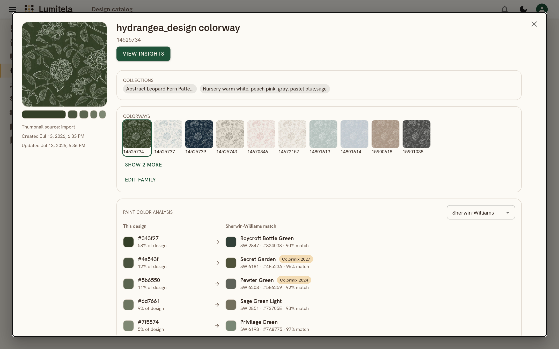
Under the palette sits the Paint color analysis. Each of the design's main colors is listed with how much of the design it covers, and beside it the closest paint color from the brand you have picked: the paint's name, its code, and how close the match is as a percentage. A small pill marks paints that belong to a named collection, such as a brand's Color of the Year.
Three brands are supported today: Sherwin-Williams, Benjamin Moore and Farrow & Ball. Switch brands on the panel itself to compare, or set your preferred paint brand once under Profile, Account, Locale, and every design opens with that brand first. Sherwin-Williams is the default until you choose otherwise.
The homepage shows what this looks like for a sage green block-print floral: its five extracted colors lined up against their nearest Sherwin-Williams matches, such as Avenue Tan and Liveable Green, each with its SW code and a match in the high nineties.
Copy a swatch as HEX, RGB, HSL or OKLCH
Click any swatch and it opens with the color in four formats, HEX, RGB, HSL and OKLCH, each with its own copy button. Paste it straight into Illustrator, Procreate, Affinity, or whatever you design in. This is the fast way to recolor toward a palette that already sells, or to build a coordinating solid for a design your buyers keep coming back to.
Why a pattern designer cares about paint matches
Your customers ask. Wallpaper, peel and stick, and home decor buyers want to know which wall color to put next to your print. Being able to say "Farrow & Ball such-and-such, or the Sherwin-Williams equivalent" in a listing, a reply, or a Pinterest pin is a small thing that closes sales and cuts back-and-forth.
Colorways stop being guesswork. Lumitela already groups the colorways of a design into families and shows, in Design Insights, which colorway actually sells. Put the palette next to that and you can see that the sage version outsells the terracotta one, then design the next family with the palette that works, copied out as exact values rather than eyeballed.
Decide what to recolor or retire. When the numbers say a design is fading, its palette is often part of the story. A quick look at what your strongest sellers have in common, color by color, is a better starting point than a hunch.
Designing toward a palette is faster. Pick a paint you want to sit alongside, copy the swatch values, and build the print around them. Or work the other way: start from a design that sells, extract its palette, and carry those exact colors into a coordinating collection.
Where the colors come from and what they are not
The palette is extracted from the design thumbnail that came across with your Design Library sync, so it reflects the design as it appears in your shop, not a printed swatch under a particular light. Paint matching is done against each brand's published color library, and the percentage is a measure of how close the two colors are, not a guarantee of how a specific substrate will print. Treat it as the shortlist you would otherwise spend an afternoon building by hand, then confirm with a sample when it matters.
Palettes and paint matches need thumbnails, so if a design shows none, sync your Design Library with the extension first. The steps are in Import your Spoonflower Design Library.
Questions about paint color matching
Which paint brands can Lumitela match?
Sherwin-Williams, Benjamin Moore and Farrow & Ball. Pick the brand on the panel itself, or set a preferred brand in your profile so every design opens with it.
Do I have to upload anything to get the palettes?
No. Palettes are extracted automatically from the thumbnails that come across when you sync your Spoonflower Design Library with the Lumitela extension. New designs get their palette within a few minutes.
Can I use the extracted colors in my design tools?
Yes. Click any swatch to copy it as HEX, RGB, HSL or OKLCH and paste it into whatever you design in.