Dashboard and Spoonflower bonus tier tracker
What's on the dashboard
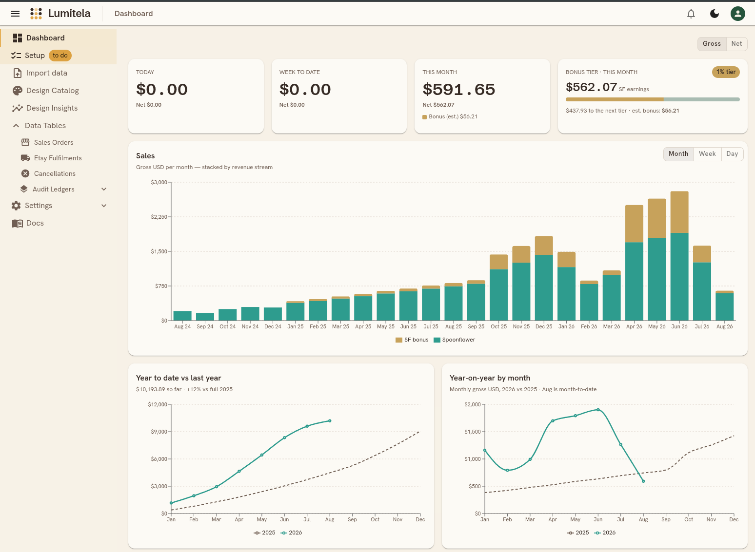
The dashboard is your home screen: a quick read on today, this week, this month, and how this year compares to last. Two controls at the top affect the whole page: Gross / Net switches every figure between gross sales and net-of-fees, and a currency pill (only shown if your base currency isn't USD) lets you flip between USD and your own currency.
The summary tiles
Four tiles across the top show your totals for Today, Week to date, and This month, plus Per day this month, which is this month's total divided by the number of days so far. Each tile's big number follows the Gross/Net switch, with the other basis shown underneath as a smaller caption. Tiles break out Spoonflower and Etsy separately when you sell on both channels, and the This month tile also shows your Spoonflower bonus on its own line.
Two small comparisons sit inside these tiles. Once you have made a sale today, the Today tile shows an arrow and a percentage against this month's daily average, so you can tell at a glance whether today is running ahead of or behind a typical day this month. The Per day tile does the same against last month's daily average.
The Spoonflower bonus tier tracker
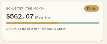
Next to the three summary tiles sits the bonus tier card. Spoonflower pays a monthly volume bonus on top of your regular royalty once your earnings for the month cross certain thresholds, and this card tracks where you stand. It shows:
- Your current tier as a chip (Spoonflower has four: no bonus, then three paying tiers).
- This month's Spoonflower earnings so far, with a progress bar toward the next tier.
- How much more you need to reach the next tier, and the bonus amount itself.
Earlier, completed months show the actual bonus Spoonflower posted to your statement. The current, still-open month has no statement line yet, so Lumitela estimates it from your earnings so far, labeled "est. bonus" until it posts. For the exact dollar thresholds and percentages behind each tier, see Fees, net sales and the Spoonflower bonus schedule.
The sales chart
Below the tiles, the Sales chart stacks your revenue by channel (Spoonflower and Etsy, when you sell on both) plus a third band for the Spoonflower bonus, month by month. Use the picker in the chart's corner to switch between Month, Week, and Day. The bonus band only appears at the Month setting, since the bonus itself is a monthly figure; switching to Week or Day just stacks Spoonflower and Etsy. Hover any bar for the exact numbers per channel and the total for that period. The chart also follows the page's Gross/Net switch, showing each channel's post-fee, post-withholding figure in Net mode.
Comparing periods
Two charts sit side by side for year-over-year comparison:
- Year to date vs last year plots your cumulative total for the current calendar year against the same running total from last year, so you can see at a glance whether you're ahead or behind.
- Year-on-year by month lines up each month of this year against the same month last year (Jan against Jan, Feb against Feb, and so on), with the percentage change on hover.
Both follow the Gross/Net switch and stop the current year's line at the present month rather than drawing a flat tail for months that haven't happened yet.
Average sales per day
Below the two comparison charts, the Average sales per day chart shows how much you sell on a typical day, month by month, over the last two years. Each month's point is that month's total divided by its calendar days, so a short month and a long month compare fairly. The current month is drawn with a dashed segment and a hollow point because it is still in progress: its figure uses only the days that have passed so far, and it settles once the month ends. Hover any point for the average, the month's total, and the number of days behind it.
The picker in the chart's corner adds a twelve-month projection, drawn as a lighter dashed line with a shaded band for its likely range. Three methods are offered, and the small ? button next to the picker explains each on hover:
- Trend fits one straight line through your past months and continues it. It works from six months of history but ignores the seasonal swing.
- Seasonal separates your underlying growth from the repeating month-of-year pattern, then projects the growth and adds each month's usual bump or dip back on. It needs two full years of completed months so every month has been seen twice, and it is the default once you have them.
- Holt-Winters also models level, trend and season, but weights recent months more heavily. It reacts faster to a change of pace, which on a short history also makes it the jumpiest.
Methods you do not yet have enough history for are grayed out, and the chart falls back to the trend line until you do. Projections fit on completed months only, never go below zero, and start the month after the current one. Under the chart, a row of figures adds the projection up: the projected total for the next twelve months with its likely range, how that compares with your last twelve completed months, the projected per-day figure a year out, and either the typical miss of the trend line or the strongest month ahead. Choose No forecast to see the plain history with a dotted line at your average pace instead.
The rest of the page
A few more panels round out the dashboard:
- Sales since... is a running feed of every order from a moment you pick (it defaults to the start of today), with a thumbnail, customer, design, substrate, quantity, and amount per row.
- Top designs by sales and Top customers by spend rank your best performers over a period you choose (today, week, month, year, or all time).
- Substrate mix is a donut of your gross revenue by substrate for the period, keeping the top 8 substrates and rolling everything else into "Other".
Prefer the numbers in your inbox? The daily sales report emails you the previous 24 hours of sales each morning, with the same month-so-far figure as the This month tile.
The notification bell
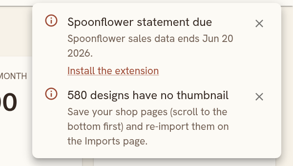
The bell in the top bar collects the things that need a look from you, and stays quiet otherwise ("All clear"). Each item says what's up and links to the page where you fix it; the small cross dismisses it until something changes. The kinds of item you'll see:
- Orders needing review: sales the pipeline flagged, and Etsy orders still waiting for their Spoonflower fulfillment match.
- Statements due: your Spoonflower or Etsy sales data ends on a date that is getting stale, so it's time to sync statements with the extension (or upload one).
- Designs without thumbnails: designs mentioned in your sales that your Design Library sync hasn't covered yet.
- Email address issues: an address you started adding but haven't verified, with mail waiting for it.
- Automatic sync waiting: the extension's scheduled sync is parked on something only you can fix, such as being signed out of Spoonflower.
- Billing: your trial is ending, or a payment didn't go through.
Substrate categories
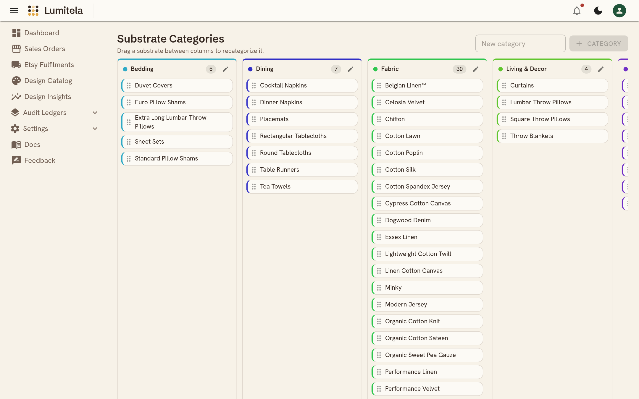
Under Settings, Substrate Categories every substrate Lumitela has seen in your orders sits on a board of categories (Bedding, Dining, Fabric, Living & Decor, Wallpaper, and so on), with sensible defaults filled in. Drag a substrate between columns to recategorize it, rename a category with its pencil, or add a new one. A substrate that turns up in an order for the first time lands in an Unassigned column until you file it.
- If you've turned on Etsy as a channel, an Etsy fees panel breaks down transaction, processing, offsite ads, regulatory, and GST/VAT fees, plus non-order overhead (listing, renewal, and account fees), noting whether the figures are locked-in statement actuals or schedule estimates for the still-open period.